Saturday, September 27, 2008

Now That's Surreal... or maybe not.

Gargh. For our next trick, we're going to learn about the various digital image manipulation techniques. First up: Photomontages and manipulation.

Your mission, if you choose to accept it, is to do a surrealist photo montage / manipulation on the theme of "Urban Fantasy" / "Urban Phenomenon" (Me: Surrealism? NOOOOOO.. i don't wanna! Anything but that!!! GARGH!!! Ed: you've got no choice kiddo. *sounds of a quarrel and scuffling*). Hang on tight... cos awaaaaaaay we go...

Chosen Technique: Photo Montage

Prototype 1:


Prototype 1A:


Tricks involved (READ: How i got the desired effect):

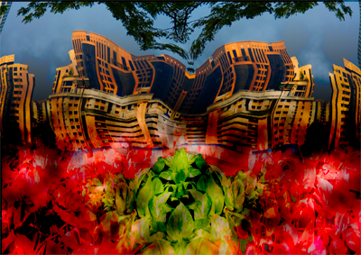
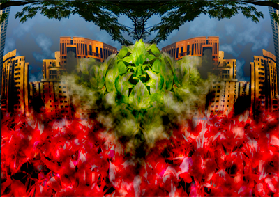
Both shots are (believe it or not) only essentially made up of 2 photographs. 1 of city scape (the flats) and a perspective shot of money plants (which turned into the red and green bits).

So what did i do? Well... basically if you notice, the flats in the picture are sort of warped and symetrical. So i started off with taking 1 picture and cut it in half down the middle. Got rid of the right side. Then i warped the remaining part of the pic, followed by duplicating the left and flipped horizontal (i'm a big fan of duplication and flipping). So voila, symmetrical image!

So... take that with the money plants, rinse and repeat (no warping this time though. Except that i did a little scaling instead). For that green "bear / lion" head looking thing, that was from a symmetrical duplication of the money plants (yes believe it or not). So it got scaled up to look more like a head (cool, no?).

To make things a little more interesting (and not to mention surreal), i threw on a few adjustment filters to screw around with hue and saturation. And to make all things blend well together i had vector masks utilising gradients to do blending. At that point, it was still a little too "bright" for my liking, so i thought, "hey let's throw on some rendered clouds". For 1A i decided that just for kicks i'd try a liquify effect using clockwise swirls on the flats, to give warping kind of feel. dunno if that worked well though.

aaaaannnd... that's about it really.

Thursday, September 25, 2008

Focus people... FOCUS....

So right. This next assignment is supposed to be about focal length, image sensors and the like (READ: Technical aspects of photography and cameras).

So... your mission if you choose to accept it.. is to take photos to show good understanding of focal length techniques and sensor latitudes. So sit tight and hold on, because awaaaaaay we go....

Perspective


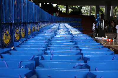
Who / What: Goodie Bags

Where: Central Forum

How: Canon 1000D; 23mm; F/5.0; 1/100 sec

Why: Shows an "almost" never-ending row of goodie bags at the central forum

Zoom Shot


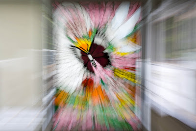
Who / What: Stained Glass

Where: My House

How: Canon 1000D; 55mm; ISO 200; F/32; 1.0 sec

Why: Shows the zooming in towards the butterfly. With the focus on the butterfly giving it a sort of awe-inspiring feel.

Close Up


Who / What: Flower from Cannonball Tree

Where: Tanglin Road

How: Canon 1000D; ISO 400, F 5.6, 1/250s, 208mm

Why: The shot was taken with a 55-250 zoom lens (doesn't look like it right?) which surprisingly allowed this shot to pass off as a macro. So why is it close up? well obviously the details in the flower are visible.


High Key


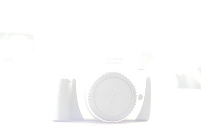
Who / What: Canon EOS 350

Where: My House

How:Canon 1000D; 50mm Prime; ISO 400; f1.8; 1/4 sec

Why: A very literal and over-exposed photo which shows obvious high-key traits, while still giving the impression that the camera is being viewed through fog.

Low Key


Who / What: Cranes in Wood

Where: My House

How: Canon 1000D, ISO 800, F 1.8, 1/20s, 50mm

Why: Wooden Cranes against a "nighttime" type of backdrop of plants takes a double-play meaning on the title and images presented.


Symbollic of the Sun


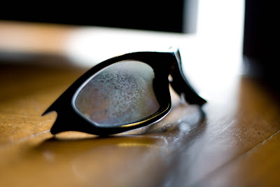
Who / What: Shades

Where: My House

How: Canon 1000D; 50mm Prime; F/1.8; 1/15 sec;

Why: Sunglasses are what people usually wear to protect themselves from the sun. a destroyed and worn out pair of sungalsses also would in some sense illustrate the damaging effects of the sun.

Tuesday, September 23, 2008

From Landscape to Portrait

Welcome.... to the art of shooting people (in the photographic sense of course) - Portrait shots. Now... there's 2 kinds of portrait shots - those set-up shots that you rig (the kind where you go "hey pose for me can?") as opposed to what i'd like to call the "sneaky sniper of candid moments" (the kind where your subjects go "eh why you take my picture sia? ARGH ARGH ARGH")

So... your mission if you choose to accept it, is to sneakily snipe shots of a NM class in action. and if it's good enough, you'll get it used in the department's publicity collaterals. so hang tight... cos awaaaaaaaaay we go...

Ok. So apparently the fact that there're 5 photographers shooting the class doesn't stop us from capturing candid shots of people in action


Who / What: Dr Ingrid Hoofd

Where: NM4212 Media & Representation Seminar Class

How: Canon 1000D 50mm Prime; ISO 800; F/10; 1/30 sec

Why: Shows Dr Hoofd in action observing one of the group discussions in class


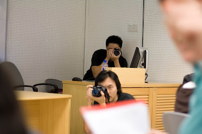
Who / What: Soh Junhao (Below) and Chris Chang (top)

Where: NM4212 Media & Representation Seminar

How: Canon 1000D 50mm Prime; ISO 200; F/1.8; 1/50 sec

Why: Its an interesting shots of photographers in action (besides, someone needs to take photos of what we do for NM3223).

Monday, September 22, 2008

Exposed!

Ok. So we're moving on now to the next level - playing around with Apeture and Shutter Speed.

Since Apeture determines Depth of Field, this most probably means we're working on the different depths of field. *ding ding ding give that man a prize!* And since shutter speed determines how fast / slow the shutter opens / closes, it determines how fast we can capture something without looking blur (and not to mention without cheating using a flash). so with that out of the way.... hang tight cos awaaaaaay we go...

Shallow Depth of Field


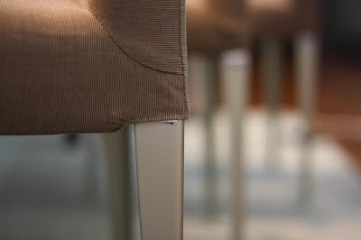
Who / What: Dining Chair

Where: my house

How: Canon 1000D 50mm Prime; ISO 400; F/1.8; 1/25 sec

Why: Its the only object in focus, when compared to all the other chairs in the background which are totally blurred out.

Deep Depth of Field


Who / What: Fire Hydrant

Where: outside my house

How: Canon 1000D 50mm Prime; ISO 400; F/22; 1/8 sec

Why: Pretty much the entire picture is in focus, but the focus of the picture (no pun intended) is the fire hydrant. Part of that is due to the colour, because it most definitely stands out amidst everything else.

Freeze Motion


Who / What: Hot & Cold

Where: YIH & Chinese Library

How: Canon 1000D ISO 250, F 4.0, 1/400s, 28mm

Why: This is one of those fans from the air cons, which as most people know, constantly is in motion. So by right what you'd usually get is like a white circle, but since there's freeze motion, you can *almost* distinctly see the blades.

Motion Blur


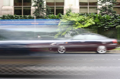
Who / What: Chasing Cars

Where: bus stop at Orchard Boulevard, opposite Orchard MRT

How: Canon 1000D 50mm Prime; ISO 400; F/22; 1/5

Why: The bus stop is just a little after the traffic light, so the cars will definitely be moving very fast because of the acceleration. The slow shutter speed manages to catch one car entering and another exiting.

The 5 Elements

Ok so its not quite Earth, Fire, Wind, Water and Metal. More like Line, Shape, Form, Colour and Texture (this IS photography after all).

So... your mission if you choose to accept it, involves taking pictures of the above-mentioned 5 elements (the photography ones that is). Restriction is that it has to be within NUS campus. Sounds simple enough? Right then. and awaaaaaay we go...

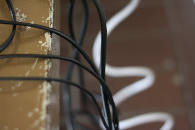
Line


Who / What: Wiring from laptops and extension cable

Where: AS6 Walkway

How: Canon 1000D 50mm Prime; ISO 400; F/2.0; 1/20 sec

Why: Shows organic lines (not straight and rigid)

Shape


Who / What: Laptop keyboard

Where: AS6 Walkway

How: Canon 1000D 50mm Prime; ISO 400; F/2.0; 1/20 sec

Why: a very squarish / rectangular photo featuring a lot of similar shapes (right down from the laptop to the individual keys)

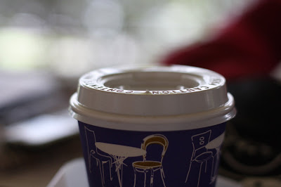
Form


Who / What: One of those takeaway coffee cups from the Arts Canteen

Where: AS6 Walkway

How: Canon 1000D; 50mm Prime; ISO 400; F/2.5; 1/125 sec

Why: Its cylindrical, its big, it definitely looks 3D (which is what form items are supposed to look like right?)

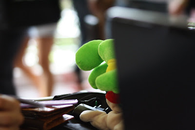
Colour


Who / What: Frog Soft Toy

Where: AS6 Walkway

How: Canon 1000D; 50mm Prime; ISO 400; F/1.8; 1/20 sec

Why: in a world of very dull and dark colours (like brown and black), a bright green soft toy most definitely stands out.

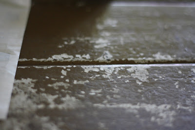
Texture


Who / What: One of those benches along AS6 Walkway

Where: AS6 Walkway

How: Canon 1000D; 50mm Prime; ISO 400; F/1.8; 1/60 sec

Why: Its an uneven, scratchy and dare i say paint-peeling surface. Surely that's a texture with age and CHARACTER?

Friday, August 15, 2008

Say something about what you see.

I was asked to comment on photos from the following:

1. World Press Photo of the Year

2. International Photographic Art Prize "Arte Laguna"

3. Digital Camera Photographer of the Year

And probably one of the first questions i asked myself was this: "What makes a good photo?" since obviously people thought that these photos were good enough to win prizes in their own categories.

It could be said that the following criteria would apply when examining photos:

1. aesthetics (composition / lighting/ contrast)
2. portrayal of a message / story
3. impact

So how does this apply to the photos from the following sites? There's 2 ways of looking at it - individually and collectively. Obviously in the collective sense they would have had to meet the criteria to even warrant being considered, so the question then is what separates the best from the better and the good?

Let's take this picture as an example. Based on comments by the judges who thought that "this was a clear winner, despite the harrowing nature of the image. The photo almost defies belief. It’s also helped by clear, simple lighting and composition. What this does demonstrate is how a good, simple treatment of such a remarkable subject can still produce a memorable image."

Obviously in this case what they were looking for was more a case of impact and composition being of greater importance. Of course there's still a message behind it and it does tell a story (because i think all 3 aspects are something inherent in pictures), but the thing in this case is that the focus is very obviously on 2 of these aspects.

For another example, let's consider this picture. According to the site it was the "World Press Photo of the Year" for 2007, ahead of other photos in the different categories (which had their own winners of course but didn't make it for the big one).

So why did it win? Probably because in the case of this award, it was the aspect of the story / message that was important (the competition is for press photos after all, and they're supposed to tell a story of sorts).

Finally, let's consider this one. This one would seem to have its judging criteria based solely on the aesthetic aspects such as composition, lighting and techniques involved for digital manipulation. There isn't much of a message behind it, and impact-wise, somehow it doesn't quite measure up against the other 2.

So from looking at all 3 competitions and their winning entries, what do we learn? That basically, what makes a "good photo" varies. The intention of the photographer at that moment does play a part in the end result, because it will affect all 3 criteria mentioned earlier, and it does show through the pictures.

Monday, February 25, 2008

Monday, February 18, 2008

That Darn Assignment Part Trio

Interesting comment in my IVLE upload: 14 people commmented on my blog. Is that a good enough excuse to be later than 6.30pm?

So here's my response to the 14 comments individually. For a general one, please view the comments in Part Deux.

“I think you have a great storyline going on. The pictures in the beginning showed sadness (the letters, gifts, when were depressed). However i think the rest of your pictures didn't really portray it clearly enough? Were your pictures supposed to express loneliness?

Plus i realised that your pictures didn't contain any people in it. Is there a reason for it? Personally for me, i feel that one of the ways to express loneliness in a person is to take the picture of a person who looks lonely. Eg. a person sitting on a bench, or a person reading a book on his own? Basically, taking pictures of single people doing some form of activity on their own. =)” (Rebecca Oh)

Good point on that. However the intention was that these places where I used to go are now empty because… well, I’m alone.

I think it's because these are specific memories shared by you and your ex. So to the rest of us we don't see much relevance of it to us.

I suggest you could 'hire' a girl to act as your ex? Like you two can sit on the benches together in one pic, perhaps in black & white, and then in the next pic, in color, the bench is empty. Think the feel of sadness would be stronger. :) (Anonymous)

Spot on with that one. Gotta remember that I’m making it for other people, not just myself.

“Hi Chris, I like your idea of finishing the video off with a scene similar to the opener. However, I feel that to make the whole thing appears as 1 session of reminiscing, you should start off with your character staring into space and perhaps end with someone else shaking your character out of his daydreams.

Also, I agree with what Rebecca said. To portray loneliness, the best way will be to show a person being alone. In the pictures that showed at the end, I could only see various items/scenes and they do not seem to express any meaning.

Perhaps you could add people into the video? That would add a human touch and create empathy.” (Xueli)

Good point. That means there’s an obvious problem there. The pictures aren’t tell the story correctly. I’ll need to do something about that – better pictures or different pictures.

“Hi, I thought that probably you could have some text or some description going on at the beginning of the clip so that one could understand your video right from the start? Cause actually i didnt really understand the story in the beginning. but, nice song =)” (Anonymous)

Ok that sounds bad. The fact that you couldn’t understand the starting bit means there’s really a problem with it somewhere. I thought that of the whole video, that part would have been the most self-explanatory.

“Chris~ I don't like the music and then the narrative part butts in like the video you provided. It's distracting. May be you wanna narrate with the background music altogether? Contradictory to what Rebecca feels I think the empty spaces works out fine for your part. I could sense it. Someone commented on using an actress... I don't think you will do it right. And I would say not to use it. It's bad and the other is it's like the aftermath of a broken relationship so don't think you should include. And I guess what you want to portray is the emptiness more than recalling the good old times aye?” (Su Pei)

You’re spot on with that bit. But I dunno if the video is achieving that aim considering the other feedback I’m getting. Seems like intention differs from perception.

“Similar to what the rest have commented, I do not really get the feel of loneliness you are trying to portray. Especially the series of the benches pictures.

Perhaps you could get some one to pose as your gf and you sitting at the benches Followed by the next scene is her gradually fading away. Guess that will portray a better feel of loneliness and sadness.

In addition, i feel that currently your .mov has a lack of human touch, is very cold. Just a suggestion here, instead of ending the story with two paragraphs, you could narrate yourself. I believe this will make your .mov more meaningful and touching especially if you can narrate it with a sense of sadness” (Anonymous)

1. Ok that one, personally I thought was a bit of an issue as well. But I wanted them empty. Maybe need to portray better.

2. Really? That wasn’t the intention (but probably the perception). Might need to work on that. Then again this video is about painful memories of what was. So cold may not be such a bad perspective.

3. Narrating is definitely an option I think. I need to toy around with the idea more. Just that I thought it was more impactful for people to read. Maybe read AND narrate?

“I like the idea of your story because it's very different. Pictures wise, I am able to get the story in the beginning. I think the song played a huge role in telling your story:)May I know where did you get your song from? Perhaps you could let the music fate into silence than having it shut off all of a sudden.” (Ting)

Hmm that’s good. But if its only at the beginning then it doesn’t achieve the purpose because then after that if no one gets it then it doesn’t work.

Unfortunately the song won’t be appearing in the final. It’s just a placeholder. Though I really did feel that it was extremely apt.


“Although I think both ideas work, i.e. with or without actors, I say the choice is yours, I quite get the sepia transitions hmm but perhaps you could desaturate the photos at the second part to look sadder.

Also, I think that for some of the shots theres a odd black space, which are interweaved with the photos that are full screen, to me if feels just a little odd, maybe if u could put all the photos full screen or separate the two?” (Mark)

Hmm… well all the photos were just thrown in “as is”, no touch ups. So might need to do a bit of that. That might help achieve the desired effect

The space comes as a result of having portrait photos which don’t occupy the whole screen. The only way to fix that is either use all landscape pics, or zoom in. Need to play around with that a bit more.

“I can feel the sadness in your video. And i think without the girl charcter would be better. Does the empty spaces hold some memories to you? That's how I interpret the empty spaces and I think it works fine. The song is also nicely fit with the theme of your story.” (Rash)

Thanks so much Rash! And yeah that was the point of the empty spaces.

“Hey i think the music is nice, but convey a feeling of missing someone.. instead of the anger you tried to portray last week at Valentines Day... Perhaps the visuals can focus more about the end of a relationship, so that we can see the story better, and feel for the character better, instead of items that symbolizes the relationship, because it may not be known to the audience. =)” (Ozeona)

Well… I wasn’t exactly trying to portray anger I guess. While its true that I detest V-Day, the aim was always more about remembering what was. And even then it wasn’t supposed to be the happy type of reminiscing.

Point taken. Might need to work on that.

“I thought that your song is a little unsuitable cuz i was expecting something like a really sad, sad song. Also, I think there should be some shots of you interacting with the inanimate objects, like looking at the letter, with your chin resting on the table and sadness in your eyes?

But other than that i guess you story is working out well.” (Hui Ting)

That’s an interesting suggestion. There’s going to be a little of that at the end I guess. But maybe need to put more.

“Hey chris, i would say a good effort for a draft. The song fits the whole feel of the video in terms of its lyrics. The words at the end aptly summarizes your video. Which is a bittersweet kind of a first love experience.

However in terms of retaining attention and capturing my eyeballs : ) it din fare as good. It felt a little monotonous towards the middle and the reason for the monotony was that there were essentially only 2 types of photos. 1, letters and stuff that she gave you. 2, places which the both of you have gone before. You could try exploring using words and blank spaces to bring variety into the video.

: ) cheers mate” (Sam)

Now THAT’s what I call feedback. Haha. Good point about the monotony. Probably need to cull some pictures and replace others.

“i feel you need a bit of text to explain some of the photos. otherwise, i feel you will have to finish the entire video to get to know what do the photos mean in the beginning...

and also i saw the video ending... but the music just cuts off... not sure if it's just on my platform. maybe you wanna check and fine-tune that part?” (Jasmine)

Isn’t that technically the point? That you should watch the whole thing? But I can see where you’re coming from, on the assumption that not everyone can catch it right from the start. I’m thinking narration MIGHT be better than text, but that needs people to concentrate more. And if they miss it then that’s problematic.

“Hi Chris:

You can consider to have the song lyrics to display when you showcase the video. But knowing that we need royalty free music it will be tough.

Otherwise words would be good to have so that audience can understand the video better.

Are the quotes by you? You can consider putting like the opening and closing like " ".

Great work!” (Katherine)

Thanks Katherine. Truth be told, the quote is actually from a movie I watched (also about broken relationships).

p.s. Apologies to Jasmine if my reply came across as being a bit on the harsh side.
Sunday, February 17, 2008

That Darn Assignment Part Deux

Hmm ok. Now for part 2 of this (READ: The Update)

So i've actually got some new photos added in (be prepared for another video with the same annoying background music). HOWEVER, i've also stumbled upon another great idea - based on something i watched on Star Sports the other day. I'm thinking of following the background music dispersed with narration format. Comments please *grin*

Anyway, that aside, here's the latest version of the video. It includes other places outside of school. I also intend to finish it off with a scene similar to the opener (so that the whole thing appears as 1 session of reminiscing).

p.s. if anyone needs inspiration check out this video and this one too. Its REALLY good (not to mention being my inspiration for my assignment - in terms of approach, not topic).

Tip: Press the play, then press pause to let it load. Go to someone else's blog to do your commenting and come back when its done (but don't forget to come back!)


That Darned assignment...

Ok. Truth be told, i detest V-day. I really do. That's why this assignment was so darn hard to do. But i figured out something in the end, controversial as it seems.

The low-down: do a 2 1/2 to 4 min photo slideshow on the theme of love, valentine's day, romance etc.

Requirements: make sure its your own photos (simple enough) and royalty-free music (dang!). oh and make sure there's a storyline.

So... i figured... why not do broken relationships (hence the controversy)? considering how everyone else would probably be doing those normal, happy type of stuff. so... i present... my assignment draft for this photo slideshow

Since i'm at it... why not the video draft too?

(please note that the song in the background ISN'T the actual music. Blessid Union of Souls' "Light in your eyes" was used as a placeholder of sorts... to see if i could find something with the same type of "feel" to get the same effect.)

Wednesday, February 13, 2008

So the story goes...

The challenge: grab as many pics as possible for a story, format them to a certain size and resolution, and stuff 'em onto a webpage and make sure it doesn't exceed 180kb. Sounds simple enough? WRONG!

Its perfectly fine when all your content added together hits 180kb just nicely, but is weird when your folder says you've got 320kb (what gives?). Apparently, its due to the thumbnail saving function (which produced a file that was almost as large as the folder it


So what did i learn then?

1. Hidden files like thumbnail files can be a real pain when you're tight on disk space. Best to disable it.

2. If you're doing something requiring pictures, make sure you take lots of them so that there's a good archive to work with

3. Cropping pics for perspective and focus helps get the message across

4. Anything is possible. Even at the last minute.

So to see the story for yourself, check out the pics below (from left to right then down).

[ed: another lesson also is that blogger can sometimes screw around with what you put in the post. on the blog itself all the pictures just appear as a single roll[


Sunday, February 10, 2008

Now That's Surreal...

Poster for a theatre production with the theme of surrealism... now that's tough. Cos first you need to figure out the storyline to be reflected in the poster, then you need to make it fit the theme of surrealism.

according to wikipedia: "[the works] feature the element of surprise, unexpected juxtapositions and non sequitr."

according to dictionary.com: "a style of art and literature developed principally in the 20th century, stressing the subconscious or nonrational significance of imagery arrived at by automatism or the exploitation of chance effects, unexpected juxtapositions, etc."

So... it has to look fantasy / unreal / out of this world. Doesn't seem to hard right? WRONG.

So what i settled for was something along the lines of a "what if", since the play is about dreams and sacrifice after all. So...


Now... as a first draft this is fine. EXCEPT that after thinking about it and seeing the end product in print...

1. The details of the production don't follow typical theatre posters (so that needs to be fixed)
2. I showed it to some people and its not immediately obvious (hence making it a bad poster if i have to explain)
3. The more i stare at it i realise that the picture in the centre is the draw factor (and not the ones on the sides). I don't know if that's a good thing. On the bright side that means that people will see the title of the play right?)

So... need more tweaks.

Thursday, February 07, 2008

Test Post

Sunday, April 22, 2007

Smoke, Mirrors and User Experience on the whole

Apparently this post is supposed to be a article that is considered as one that "die-die also must read". Well apparently i've read it and i'm not dead yet (ok sorry, bad joke).

anyway.... After reading through 5 parts of this article, i've got a few things to say about using scientific / objective research as a foundation of designing.

1. I finally understand what Mr Reddy means about "you will 'just know' if your product gives a2 good user experience" (but that doesn't mean that i understand his stories about samurais and attaining nirvana). In the article they talk about experienced designers not requiring hard research to know that they've done a good design (i.e. its all about intuition aka "just knowing").

2. User experience is just that - experience. it isn't something that you can quantify per se. And it's extremely subjective, varying from person to person. But I guess there's still something to be said for user experience's "scientific" research, in the sense that its more a case of providing a gauge for the general user feeling towards your product.

3. Though it may seem a little unethical at times, but i can agree that there's the possibility of needing to use "scientific" research about user experience to convince the "suits" about the validity and necessity of certain design implementations. Mostly because designers and execs think along different lines (or speak different "languages" so to speak).

Aaaaaannd.... that's about it. basically to sum up the article - user experience development is something that should not (and cannot) be solely based on "scientific" research alone.

So. enough about smoke and mirrors.

If you were to ask me about NM4210, I'd have to say I learnt a lot from it, and the times i (almost) applied it outside this module.

1. In the midst of taking this module I realised how badly-designed my CCA (NUS Psychology Society) blog is (ironical then since I was the one who designed the interface for it (disclaimer: but it was before i took this module).

2. I realised that I could have applied some of this in my TR3001 (New Product Development) module when we were coming up with the product, even though it was a physical one.

3. I've considered UX stuff in designing my game for CS4343 (Game Development Project) when designing the interface for my game.

4. I've become rather critical of website design suggestions in NM2219 (Principles of Communication Management) especially in the case where people suggest holding webpage design competitions to help improve user experience for users visiting the page.

so that's about it really.

Sunday, February 25, 2007

Improving Learning Environment in LTs... the NIGHTMARE ASSIGNMENT

I was warned beforehand that this would be a nightmare assignment (damn right it is). but get this - the nightmare didn't come so much from the actual assignment, but from DOCUMENTING AND BLOGGING (which is this part of the whole thing).

So if you're wondering how my group did it, we used a mixture of 2 methods: laddering and enthographics (through observation and interviews).

if you want to see the laddering technique in action for my group's assignment, click here.

To put it simply, what happened is we went to go and observe what happened in lectures and what conditions there were like (seems rather simple, no?). We then took down our observations and put them in a cross-comparison table just to see how they would rate against one another in terms of the various aspects.

So here's some details about the modules we used in this assignment:

NM2219 Principles of Communication Management Wednesday 10am-12pm


NM3217 Publications, Graphics & Design Tuesday 12pm-2pm

SS2229 Nation Building in Singapore Monday 12pm-2pm

GEM2003/EU2219/HY2241 Why History? The Turbulent 20th Friday 4pm-6pm

LSM1301 General Biology Friday 2pm-4pm

CS3242S Hypermedia Technologies Thursday 8am-10am

So here's some of the cross- reference data from our slides:


The next thing was the interviews (because you need something to confirm your data against after all). Interestingly enough they brought up some issues that we might not have considered before (as well as providing greater detail and explanation for others).

So since this is about improving lecture styles (and its being improved for student's benefit) then it's important to find out what the students want, because that would make lectures more appealing to them (on top of that it would probably let us draw conclusions about the way they think. and when we know the way they think, maybe we can cater to them better).

Some hypotheses (resulting from information collection):

Handouts are very important to students, students want handouts that are handed out early and well presented/logical (easily digestible); -- Students are pragmatic

Lecturers who do not follow power-slides/handouts closely in their lectures, are less popular -- Students have rigid learning styles

Student goal in going to lectures revolve around exam specific issues (perceive note-taking as key to exam success); lectures where lecturers drop hints about exams tend to be more popular – Students are goal-oriented

Other suggestions / conclusions

Well obviously my group would only approach this situation from our own point of view. and its very obvious that others, though generally having the same point of view, may have alternative and addition viewpoints which could help us get a better understanding (in short: check out their blogs).

I have to agree with most of them - except the one about feng shui (sorry Chung Hau). Though most of us perhaps got around the same kind of responses (or the general feel of the situation), on our own perhaps we need to gather more data, if only for the fact that small sample sizes are rarely representative of the entire population.

I guess while we can rant and make suggestions about how to make LTs better, there're definitely limitations (some of which are beyond our control, others within our control but we refuse to follow through for various reasons - like... who wants to pay more school fees? surely not EVERYBODY... even if it means LT upgrading).

So maybe the disclaimer right at the start of the assignment was right - don't expect to be able to change things.

Sunday, January 28, 2007

RMA

Name: Max

Age: 24

Occupation: student in NUS

Profile:

Max is a university student who is media- and tech-savvy. He professes to be "extremely attached" to his tech gadgets like laptop, digital camera, MP3 player and Xbox 360 game console, and claims he would "probably die" without them. With all his interest in technology, it is no wonder then that his area of interest in school is computer science, with a focus on interface (hence he can get rather anal about things with badly-designed interface).

Max is the eldest of 4 children and stays in the east side of Singapore. Hence he spends a lot of his time travelling to and from school via public transport, spending about a total of 3 hours a day commuting on the bus. He would rather do this than stay in hall because he believes he should spend time with his family every day. To him, people in his life are important. So apart from making the effort to stay home when he can to spend time with his family, he goes out with his close friends to do stuff together like play soccer or just go and "hang out".

As a hardworking and driven student who is gunning for 1st class honours, Max feels the constant need to be productive. He believes that good time management is essential, and that everything should be prioritised and organised so that there is maximum efficiency, then he can get as much free time as possible after focusing completely on his schoolwork. He is someone who definitely believes in working hard and playing hard.

Max is also a lover of music, and listens to many different genres. Often he can be seen "plugged in" to his MP3 player, especially when he does his regular jogs at east coast park on weekends. He is an avid gamer, and spends any free time he has playing sports games on his Xbox 360, claiming that it's his source of catharsis and relaxation. According to him, it's also because he gets an extra "kick" out of it because of the thrill of the games. Most of the time, he has enough discipline to know when to stop.

Some of his friends have been amazed at Max's ability to eat "anything". He isn't fussy about his food, and his favourite saying regarding this is "I don't care what it looks like. As long as eat already don't die then good enough" (i.e. He doesn't care what it looks like. As long as it's edible and doesn't kill him, he'll eat it). Some of this nonchalance is also evident when it comes to gadgets that Max gets. Things like size and colour of gadgets are secondary considerations to Max when he makes choices regarding his tech toys (unless they're in colours like shocking pink). To him, the functionality and features of any gadget, as well as the ergonomics of it are what matters (Max totally hates things that are badly designed ergonomically) , because he doesn't buy stuff because they look good or make him look good - he buys stuff to use it. Most of the time Max wouldn't splurge on a tech gadget unless he thought it was really worth it - so they have to have a certain appeal to him.

4-pleasure analysis:

physio

- Likes listening to music

- Keeps fit by running regularly

psycho

- plays sports games on his Xbox 360 to unwind and get a "kick"

- Likes to fiddle around with tech gadgets

socio

- Likes to make the effort to spend time with his family

- Likes to do activities like playing soccer with his friends.

- isn't image concious

ideo

- hardworking and driven

- efficient

- ambitious

- flexible and not fussy

- practical

- believes in the need for good design

- isn't a spendthrift


Product Benefit Specification (Aka a handphone for Max should have...)

1. many different functions

2. doesn't have to look fantastic

3. needs to be ergonomic

4. needs to have good interface

5. should not be too expensive


Reccommended product:

Nokia N73 Music Edition


Features:

  • has up to 2GB of memory
  • plays MP3s
  • can sync with PC to manage music
  • takes videos and photos
  • can share photos, photos and video can be edited either in phone or on computer
  • big screen with easily navigable user interface (according to nokia)

Sunday, January 21, 2007

Visceral, Behavioural, Reflective - a Reflection

your friendly UX designer was asked this week to go hunting around for examples of visceral (initial impact / appearance), behavioural (functionality), and reflective (message it gives about owner's taste). it has not been an easy search i can assure you (considering how each of them overlaps, and how the companies try to sell them with all 3 design emotions in mind)... but i've tried to find something (and hopefully its a good comparison)... and awaaaaaay we go!

Subject of comparison: LAPTOPS (i.e. laptop BRANDS and the images they portray)

Brands being compared: Apple, IBM (or is it Lenovo?) and.... Sony? (ok the last example was pretty difficult to find).

so now that we have the participants, let's play a little guessing game...

The Apple Macbook


"AHHHHH! MACBOOK BLACK!!!! I WANT!!!!"


I've had friends who've been DYING (and i do mean DYING) to get their hands on a Macbook, the black one especially. One particular one had this reaction when she saw a black Mac at the co-op "AHHHHH!!! i WANT!!!" which in my opinion is rather representative of most people who want a Mac (a rather insightful friend pointed out designers don't count. they use Macs for functionality, not cos it looks "cool"- you gotta be pretty "cool" to begin with if you wanna be a designer, so they don't need that extra boost).

So... based on the dominant reaction of all those people lusting after Macbooks (the black one especially), i'd say that the dominant design characteristic would be VISCERAL (though reflective could come in a close second because of the "cool" factor").

IBM / Lenovo


A quote from a friend about IBM / Lenovo laptops: "Reliable, no-nonsense and hardy. but its damn ugly lah!!!!"


Ok. After asking around for a few people's opinions, this is my conclusion about the impression (and "reputation) of IBM / Lenovo laptops: No-nonsense, reliable, can take all sorts of hits and maintain intact (i have a friend who's laptop has taken major abuse and still works pretty fine). Functionality wise, it comes with all sorts of stuff that you get with every other laptop, but is built to take more hits (and more importantly, survive them). So... i guess that would make it a BEHAVIOURAL-type design (i can't say much for visceral or reflective elements...)


Sony Vaio


the PC vs Mac vs Vaio advertisement (the "non-pc pc"? er... right. a PC by another shape or colour is still a PC):

So anyway... At first when i took a look at this ad (and the sony Vaio in general) i wondered to myself... is this more reflective? or visceral? I mean, i could easily file this under REFLECTIVE and end off my post, but i want to elaborate a little on the difficulty in this area (the other 2 were pretty much no-brainers). Reflective design is supposed to say something about the owner of the product, no? and the only way to get that across is to build brand image and perception. If that's the case, i can very easily just take one of those HP laptops as an example (especially with their "The computer is personal again" ads (which are rather well done i should think).

Then i realised unlike Visceral and Behavioural design, REFLECTIVE design is not only personal, but also a matter of how that perception is built (like through advertising). And I think Sony's above-shown ad would be an example of trying to push for the idea that it classifies as REFLECTIVE design in the sense that it makes you "cooler" than a dude who owns a mac (which would DEFINITELY say something about you).

Sunday, January 14, 2007

NM4210: Badly-designed Learning Report

If there's something i can think of that's badly designed, its definitely got to be the doors to those classrooms along the AS1 walkway.... and if you wonder why....

Most (or a rather large majority) of door handles are designed to be pushed down in order to open the door. The door handles for classrooms at the AS1 walkway however have to be pulled upwards in order to open them, effectively meaning that by pushing them downwards (like you would for normal doors), you're locking yourself out instead of opening the door.

This makes it a bad design in the sense that its non-conventional. I admit it's unusual (perhaps 'cool' even to some), but when you're late, rushing to a classroom and trying to open the door, the last thing you need is a door handle which doesn't follow the standard conventions.

I'm pretty sure most people who have had lessons in the AS1 classrooms have either personally experienced or at least witnessed a harrased student trying to rush into class, only to be unable to open the non-conventional door, which would probably lead to a lot of frustration for them because it makes them even later than they already are.

After a few unsuccessful attempts (and some help from students in the classroom), they would finally be able to open the door.... and probably learn that the door handle is supposed to move up instead of down. Since the door has no "brand", it would hard to actually figure out a user's impression of the brand (except maybe if you consider comments like "why on earth did anyone design doors like this?" to be a negative impression of the architecture firm that designed the doors).

So what do i personally think of this product (if you could consider it a product)? I think that while it seems like a unique idea, it is a bad design in the sense that it works totally opposite to conventional designs for similar items. People have conceptual (mental) models about how things should work (which generally are conventions followed by the majority), and if a design goes against these conventions and conceptual models, it will be difficult for people to understand and use these products.

As for the user reaction, i would think that it is normal and understandable. Given the circumstances where the evidences of this atypical and bad design occurs, they have every reason to feel frustrated. When someone is in a hurry or under stress, they rarely think about the exceptions to the rules (such as the way this particular door handle works), often resorting to those conceptual models they know and which have become habitual, so naturally they would try opening the door by pushing the handle downwards (and get frustrated when it achieves the opposite result of locking them out of the room).

Monday, January 01, 2007

oh WOW! DOTA!

i don't really post here much anymore (not since i ended NM3216), but as i've always said "There's some things you can never really run away from."

so anyway... had dinner with mum's side of the extended family, on the table with all the cousins who have a minimum age of 18 (going on 19). Funny how at one point the conversation swung in the direction of DOTA and WOW (like i said... there's just some things you can't run away from).

I found it funny how this particular cousin of mine has now become somewhat of a DOTA fanatic (when about this time last year i recall him saying he could never understand why all his friends were persistently playing that game).

Well one year on, and things certainly have changed haven't they? on an even more interesting note, there seems to be a little inter-family DOTA competition going on (where Dota-playing siblings team up against their similarly teamed-up cousins), and where they seem to be playing for bragging rights (like my cousin said, "We have t PWN them so that at the next family gathering we can rub it in their faces!").

The other topic of interest was WOW (World of Warcraft) - mainly because i brought up the recent Season 10 episode of South Park called "Make Love, not Warcraft". Its interesting to see how immersive the game is, and how people are aware the level of immersion can reach. My cousin said that when the original WOW came out, he "lost all his friends" except when it was tuesday night (only because the server is down for maintenence). Now that most of them hit level 60 or so, he's got his friends back (or at least till the expansion comes out some time this year). The most interesting bit of all i thought, was when he said that "there's no way he's going to start on WOW, because i know once i start i won't stop." Such is the level of immersion (the guys at Blizzard Entertainment are geniuses i tell you).

Friday, October 27, 2006

Cowboy X REDUX

hmm. so we've got some problems with the core mechanics of our game. as its been mentioned during a consultation session we had, the very nature of the core mechanic is what gives us problems. the whole premise about the game is controlling without giving the player control - and the lack of the player's sense of control is the biggest concern.

So its back to the drawing board for the crew of Cowboy X.

Stay tuned...